 GIF extracted from https://www.youtube.com/watch?v=nXXyWLft1zc
Disclaimer: Some contents written were based solely from my experience uppon using the Appdynamics dashboard. So suggestions and a more in-depth overview about appdynamic’s products are much appreciated.
Appdynamics
Appdynamics like many other Application Performance Management (APM) tools helps you to trace, spot outliers and setup warnings when a certain service-level objectives (SLOs) such as response time or errors per minute, etc, happens by providing incredible visuals as well as the ability to drill down into the call stack methods to find the method at the exact moment an incident occured.
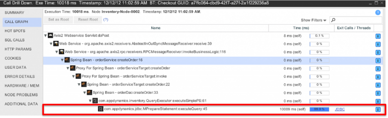 Image taken from https://solucaoprimeitapmappdynamics.wordpress.com/tag/appdynamics/.
D3.js
D3.js is a javascript framework in which my first use case to it was to better organize basic lists and blocks with data loaded from APIs but its strongest feature and use case is that it allows you to bind arbitrary data to the Document Object Model (DOM) and then let’s you to pretty much render anything you want on the browser using HTML, SVGs, CANVAS and CSS.
 All D3.js examples here https://github.com/d3/d3/wiki/Gallery.
Appdynamics caveats
To state that this isn’t a “flaw” tothe Appdynamics product. It’s just that it didn’t suit my use case at first. Consider for example the first GIF of this article and the image below.
 Image taken from http://dailyrevshare.com/database-transaction-flow-chart/database-transaction-flow-chart-elegant-overview-of-application-monitoring-4-4-x-documentation/.
By seeing those two pictures one can tell that Appdynamics perfectly describes each remote calls (called business transactions) and generates a component (represented by a visual circle) based on each application and features, such as the Database server and its model + database name or the Message Queue (MQ) server and its topics.
So one cannot have a macro view of the infrastructure as a whole. What if I want to see which applications talk to one database? Which MQs depend on application X? Application Y is on top of which infrastructure (physical, vm, cloud)?
To answer the questions above one would have to manually go through all the applications and check if each one of them has a connection to database X for example. And when you have more than 50.. 100.. 1000.. applications.. you see where this is going. right?
 Appdynamics menu taken from https://www.g2.com/products/appdynamics/details.
So the image above shows the appdynamics menu taken from the browser where you can see the tabs Applications, Databases and Servers segregated.
The “Applications” tab indeed shows all the communications between them except for the databases and each objects representing the topics of each MQ server is shown instead of a unique node representing each MQ server.
Appdynamics API
Luckly appdynamics has an extensive and well documented API where you can follow these few and easy steps to get access to its REST API or RESTUI. The latter not documented though with warning of unnoticed changes on further releases.
So you can just POST to /controller/api/oauth/access_token with your credentials to get your token:
curl -X POST -H "Content-Type: application/vnd.appd.cntrl+protobuf;v=1" "https://<controller address>/controller/api/oauth/access_token"

{
"access_token": "...",
"expires_in": 300
}
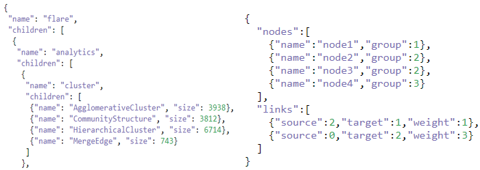
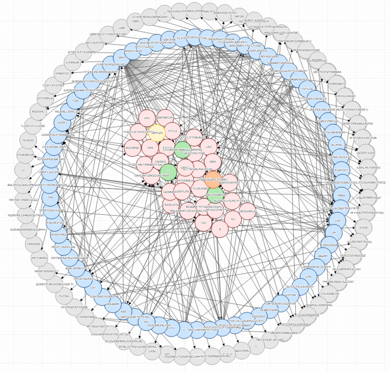
After this step you can just thought all Application’s Business Transactions and build a Directed Acyclic Graph (DAG) characterizing each Application’s dependencies. You can save this graph in structure you want but remember that if you save it in one of these two JSON formats you’re pretty much up to plug-n-play your new JSON to any hierarchy or treemap style of d3 example to see your data in action without needing to touch any javascript code… yet.
 Layout 1 on the left. Layout 2 on the right.
Push data to D3.js
So I found one example that best suited my needs and.. boom! Right what I was looking for.
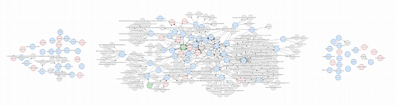 D3.js result from DAG graph generated from Appdynamics.
Then after filtering some keywords that belonged to other applications and services it became more like this:

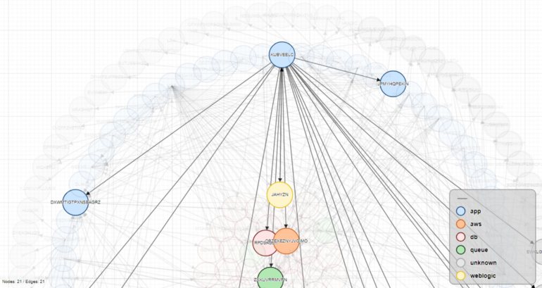
After hovering over one node:

Then moving to the hacking phase where you’re able to tweak some parts of the code to suit your needs.

Making it more organized and insightful when hovering:

You can pretty much do whatever you like by messing with the force. Like my attempt to copy appdynamics’ layout.
After hovering:
I know there’s plenty of tutorials about D3 and force graphs but I wanned to show you my use case and how you can first preview your data before having to mess or build a D3.js code from scratch which has a considerable learning curve like Paul Sweeney commented. Thank you!
References
- https://bl.ocks.org/agnjunio/fd86583e176ecd94d37f3d2de3a56814
- https://medium.com/@sxywu/understanding-the-force-ef1237017d5
- http://vallandingham.me/abusing_the_force.html